UX and SEO: A New Perspective on Winning at SEO
Here’s what a great user experience looks like:
- Give users a satisfying answer to their question.
- Do this blazingly fast…
- …through a site that’s easy to use on any device.
You can achieve that with these four steps:
- Hit search intent
- Win the actual click
- Answer the visitor’s query…
- While making sure pages load fast, the website is usable on any device, and the usability is good.
The key to your users’ and search engines’ hearts is delivering a great user experience.
How does UX affect SEO?
Over the last few years, user experienceUser Experience
User experience (or UX for short) is a term used to describe the experience a user has with a product.
Learn more (UX for short) has become a major ranking factorRanking Factor
The term “Ranking Factors” describes the criteria applied by search engines when evaluating web pages in order to compile the rankings of their search results. Ranking factors can relate to a website’s content, technical implementation, user signals, backlink profile or any other features the search engine considers relevant. Understanding ranking factors is a prerequisite for effective search engine optimization.
Learn more for Google. Therefore, more and more SEO specialists have gained an interest in UX.
We’re introducing two commonly misunderstood terms here, so let’s first explain what we mean by them:
1) When we say “ranking factor”, we mean an element that influences your rankingsRankings
Rankings in SEO refers to a website’s position in the search engine results page.
Learn more.
2) When talking about “user experience” within the context of the web, we define as a great user experience one that:
- Gives users a satisfying answer to their question.
- Does this blazingly fast…
- …through a site that’s easy to use on any device.
So: UX is important to SEO. But how do you go about delivering a great user experience that doesn’t hurt the rest of your SEO performance?
That’s exactly what we’ll cover in this article!
UX has never been more important to SEO for two reasons:
- The role of mobile user experience;
- The need to engage, keep and convert users in a competitive space.
The user needs to receive intuitive signals immediately on a site since user delight is a primary concern for search engines. This user delight needs to continue when the visitor arrives from a search result page on a site. The HEART Framework, created by Google's Kerry Rodden, is a good framework to explain this user delight. The framework measures user happiness across these key metrics:
- Happiness
- Engagement
- Adoption
- Retention
- Task Success.
Ticking all these boxes is a sign the User Experience is on point!
We don't need any of the conspiracy theories. Just knowing that Google is training algorithms like Panda to have their computers like the same kind of things that humans like, and that Google is evaluating algorithm updates against qualitative and quantitative user experience metrics is enough.
We should be building our SEO hypotheses by aligning with user experience. We're investing a lot into starting here, and then testing our theories. Check out my presentations from SMX Advanced Europe for more information.
Giving users a satisfying answer to their question
So users have a question, and they want a satisfying answer.
A satisfying answer means one that massively helps their quest for answers—or maybe even ends it, because you’ve answered their question.
To figure out how to craft the answer your users are looking for, you need to understand their “search intent”.
Search intent is the “why” behind a query—why is this person searching? What problem are they looking to solve? Figuring out the search intent behind a query is the first step to coming up with a satisfying answer. Failing this step means you’ll fail at it all: delivering a great user experience, driving organic traffic, and making sales.
After you’ve figured out the search intent behind the query, the next step is to create the answer—in the form of content. That content can be packaged in different ways; think beyond just text. Other content types such as images, videos, presentations, podcasts, and helpful tools can play an important role too.
Gone are the days of optimizing copy and code just for crawlers. Search engines care deeply about providing users with quality experiences, so SEOs must put their audience needs first to succeed in and beyond the SERP.
Cater to every aspect by providing:
- An easy to navigate, speedy site optimised for all devices.
- Relevant content that meets the intent of the searcher at the correct stage of their journey - trigger events, awareness/research phases, comparison and conversion.
By all means keep the crawlers happy with flawless Technical SEO, but don’t forget about the actual eyeballs on screens. Turn their click-through into a ‘long click’ - if they are satisfied with your content and experience, they will most likely stay on page (or your site) for longer.
Understanding search intent
We’ve drawn up a framework here to classify search intent. We’ve distinguished the different search intents and categorized them according to the query types you may already be familiar with:
- Informational
- Navigational
- Commercial
- Transactional
Note that a framework like this is never finished, and is not meant to be exhausting. It's meant to help you understand search intent and the different ways visitors search.
Informational queries
Visitors make informational queries when they want to learn and research.
These types of queries are typical for visitors in the “awareness” phase: the first phase of the buying journey.
1. Research intent
When visitors have a research intent, they’re looking to learn something. They want to soak up knowledge. This can mean they’re seeking a simple how-to video explaining, for example, how to tie a tie, but it can also mean they want a deep dive on a historical event.
This search intent types often triggers videos or long-read articles.
Example query: “how to make pancakes”
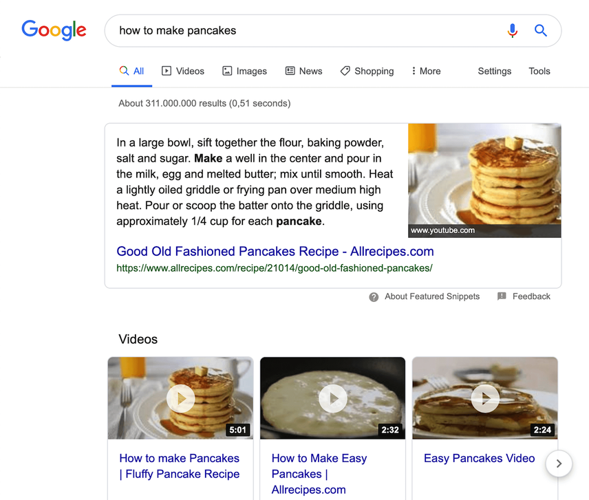
The top ranking article Good Old Fashioned Pancakes has a featured snippet, so it’s getting massive exposure.
What makes this content so great?
It includes:
- A detailed recipe that’s been reviewed over 11,000 times.
- A video explaining how the pancakes are made.
- Schema markup to give search engines context.
No matter if you’re the one creating the actual content or not, if you’re responsible for making sure content satisfies both visitor and business needs (in an agile manner, at scale) it can be extremely difficult to get the right information to your visitors at the right time - no matter the type of touchpoint you’re responsible for (for example: organic search, paid search, social media and email).
In such environments, increasing the quality (depth of detail), consistency (format), relevancy (relations) and reusability (making sure content is compliant across all touchpoints) can be achieved by using schema.org as a comprehensive basic guide (possibly even extending it, depending on your own needs) for the creation of structured content templates for all of your content and media for any and all of the touchpoints.
It doesn’t matter whether you’re an author working on an article, a category manager working on product details, a marketer writing a meta description, advertisement or even an email campaign. If it involves content that needs to be tailored to a certain need, doing so based on structured content templates will help you make sure any content created is aligned throughout all of your efforts — thus providing your visitors the smoothest of experiences - again - no matter the type of touchpoint.
2. Quick-answer intent
Visitors want a quick answer. These are often 0-click searches, meaning that the visitor’s query is answered in the SERP and does not result in an actual click to a website.
Example query: “weather new york”
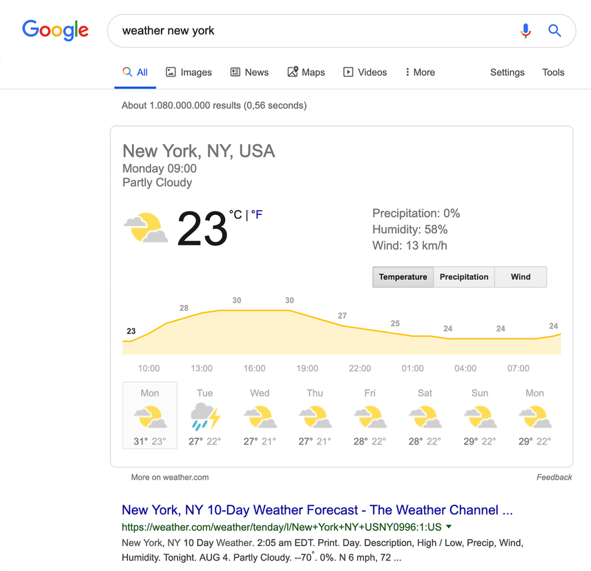
Example content: New York, NY 10 Day Weather
3. News intent
Visitors are looking for results about a recent event.
Example query: “uber Q2 2019 earnings”
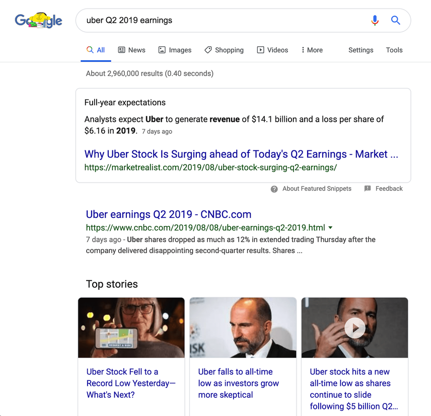
Example content: Uber's stock plummets after disappointing Q2 earnings
4. Visual intent
Visitors are looking for inspiration or examples.
Example query: “decoration boy room”
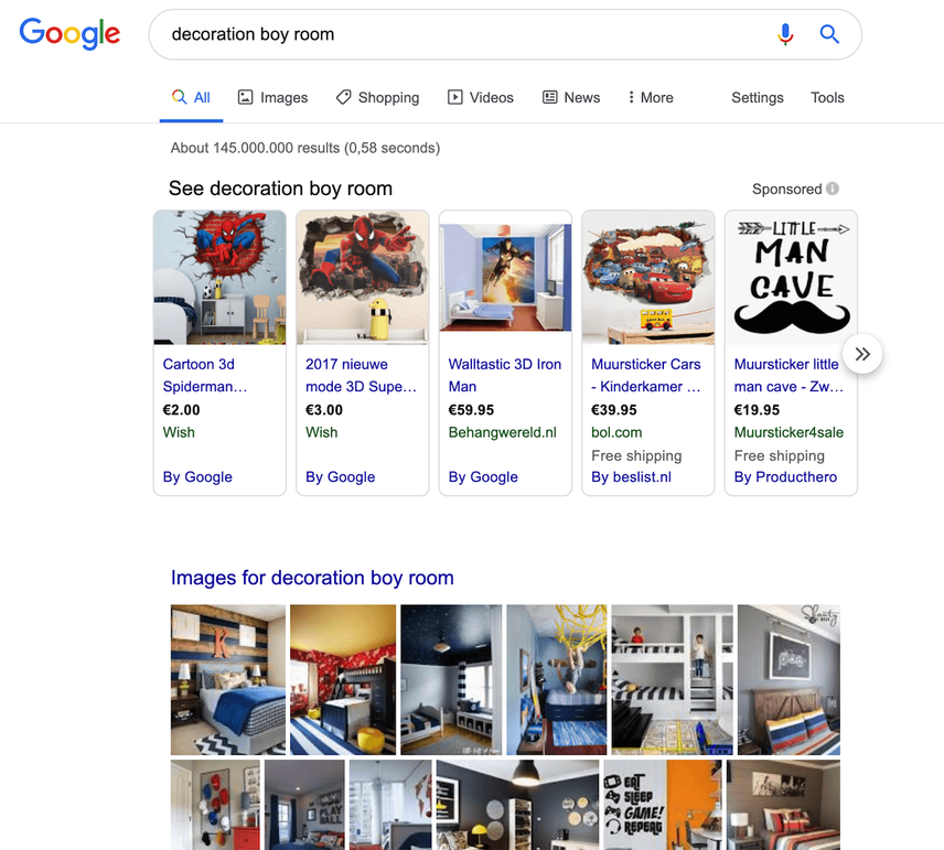
Example content: Boys' Bedroom Decor on Pinterest
Navigational queries
Here visitors know what brand they’re looking for; they’re just using a query to navigate.
5. Branded intent
Visitors are aware of a brand and are specifically seeking something related to that brand.
These types of queries are typical for visitors in the “interest” buying-journey phase.
Example query: “nikola tesla wikipedia”
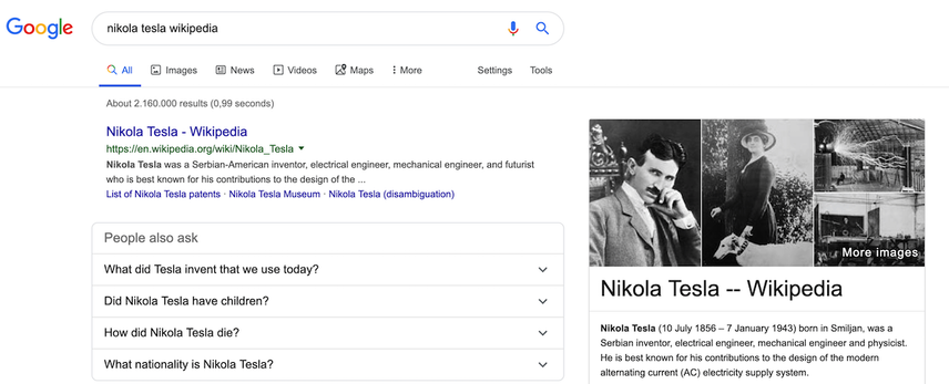
Example content: Nikola Tesla's Wikipedia page
6. Video intent
Visitors want to see video results.
Example query: “avengers endgame trailer”
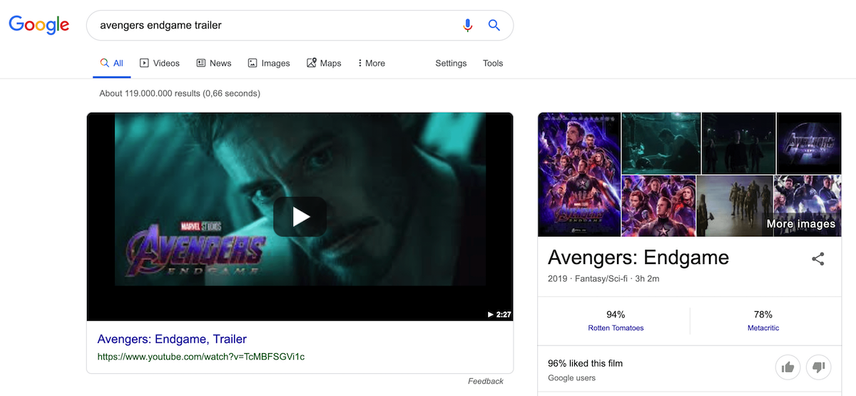
Example content: Marvel Studios' Avengers: Endgame - Official Trailer
Commercial queries
Visitors who are using commercial queries already know what they want. They’re just not yet sure where they’ll buy it. These queries are typical for users in the “consideration” buying-journey phase.
7. Commercial intent
Visitors are comparing products or services. Often these queries include words like “review” or “best.”
Example query: “best usb-c hub”
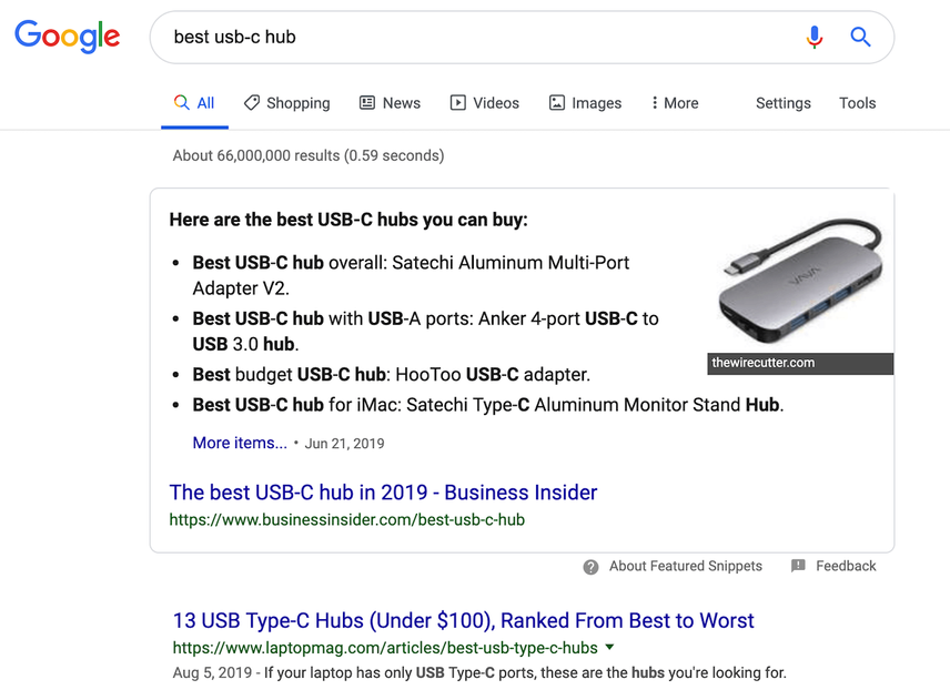
Example content: The Best (and Worst) USB Type-C Hubs
Transactional queries
Visitors using transactional queries are ready to buy, and they know where to do it too.
8. Transactional intent
Visitors are looking to buy something.
Example query: “buy sneakers online”. (Interestingly, if you search for “buy sneakers” you’ll get local results; Google assumes you want to buy them in a physical store, rather than online.)
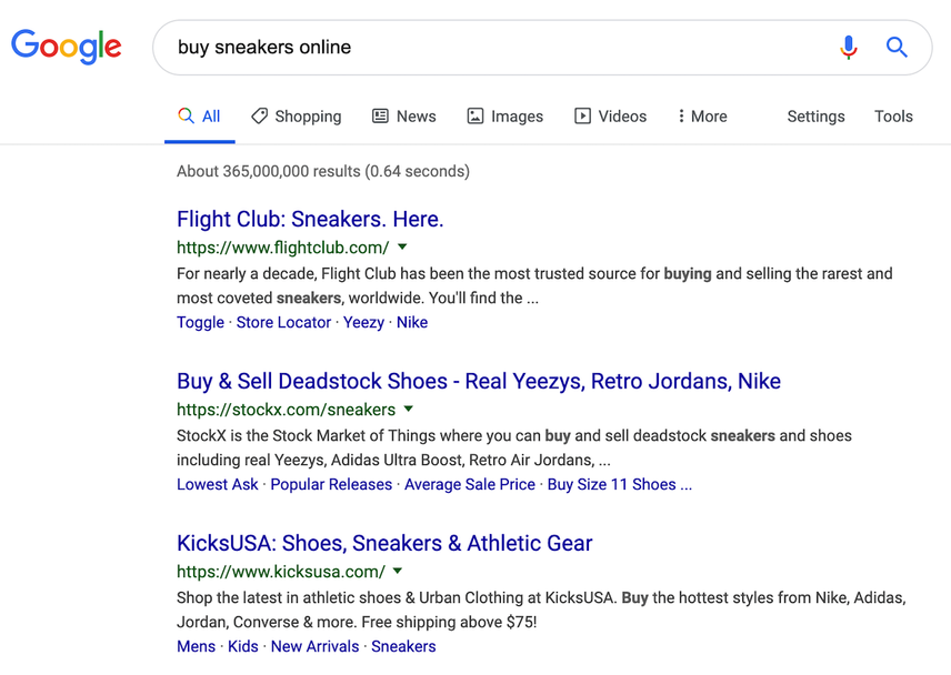
Example content: KicksUSA’s Sneakers category page
Over the last few years, Google has been updating its algorithms to push SEOs to focus on users. Search Engine Optimization is becoming Search Experience Optimization.
Many SEOs think they are already delivering a good User Experience by for example focusing on page speed optimization and publishing unique high-quality content.
However, if SEOs really want to succeed, they need to start applying UX rationale and hypothesis in their work. This will allow them to gain an insider's view on users' trust and loyalty, something that you would not be able to achieve by following traditional SEO practices.
Example: when creating a product detail page for an eCommerce store, make sure to have a clear call-to-action above the fold to make the most of the organic traffic to that page.
9. Local intent
Visitors are looking for something that’s directly related to a location. Here they’re often looking to make a purchase.
Example query: “pasta restaurant in amsterdam”
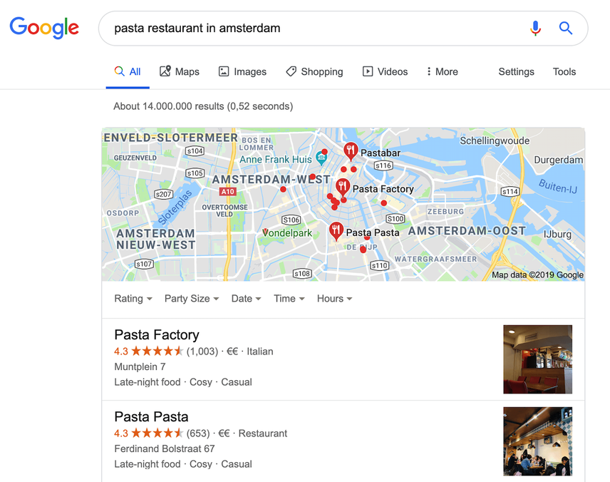
Example content: Italian Restaurants in Amsterdam
It was recently suggested that 60% of all searches had a local intent - and whether you believe the stat or not, it’s hard to ignore (as a business with physical locations or operating a service in an area) the value of local results or knowledge card. In fact, Google say that 76% of customers that search for nearby info will visit the location on the same day, which is huge (and probably contributing to the rise in ‘no click’ searches being seen).
The great thing is that Google is constantly improving their business offering to add new features - for free - to help small companies compete with the giants. The flip side is that consumers have more places they can look than ever for information - and in fact, even across Google, for searches where there is a latent (hidden, in layman’s terms) local intent a pack will show - think “mortgages” as an example.
To appear for these kinds of searches, it comes down to three things:
Being in the area.
Whether a search engine can trust your information and believe you’re a credible local business to return in results.
Keeping your location data consistent online is a huge part of this (think - you’re more likely to trust the group of friends that give you the same answer than different ones) - but so is showing that you’re a valued business in the location though your digital footprint.
Unknown intent
10. Split intent
When we classify queries as “split intent”, it means the intent is unclear, or there may be more than one intent.
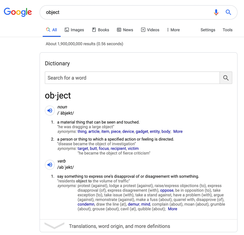
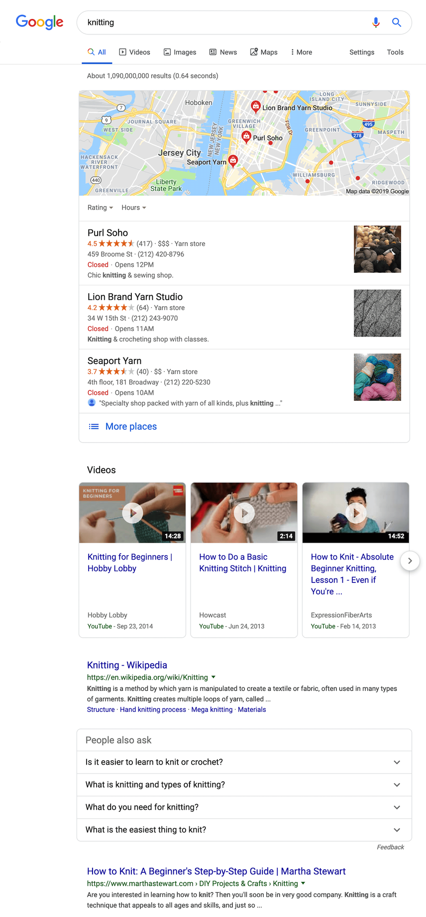
Example queries: “object” or “knitting”
The results for the query “object” are navigational in nature. Google isn’t sure what results to show you, so it explains the different meanings of the word, likely resulting in a follow-up query.
The results for “knitting” are a mix of local activities, videos on how to knit, and explainers on what knitting is.
- Query Intent - AJ Kohn, Blind Five Year Old
- How Intent is Redefining the Marketing Funnel - Think with Google
- How People Search: Understanding User Intent - Dan Taylor, SALT
- See sections 2.2, 12, 15 and 13.2.1 of Google’s Quality Rater Guidelines .
The impact of word count on satisfying answers
A satisfying answer can be really short! You don’t need to write a 3,000 word article to rank for the query “denzel washington age”.
Don’t try to answer an easy question with a 3,000 word article. That’s how you miss search intent.
To summarize, here’s what to do to give a user a satisfying answer:
- Understand the user’s search intent.
- Create content that really answers their question, using the content type(s) that are likely to help the most.
- Make the article as long or short as you need to.
Far too many people that long-form content is either absolute canon, or absolutely worthless. The easiest way to figure this out (similar to search intent) is to evaluate what's ranking currently.
Millennials, especially, get a bad rap for have no attention span and it (falsely) leads a lot of people to only write short blog content. However, every study on attention span focuses on people's attention to advertisements, not good content. Those same millennials (including me at 35, the Gandalf of millennials) that hate watching ads also watch 5+ hours of Netflix in a row. I read a 6,600 word essay on mental health the other day because it was incredible writing and met me perfectly where I was at. If the search you're trying to rank for requires more long-form content (based on what's already ranking), you just need it to be GOOD.
Winning the user’s clicks
You know what queries you want to rank for. You’ve created the best content out there, it’s starting to rank… but is it winning the user’s clicks? Are your snippets engaging, and do they stand out?
Most people forget about this stage, but it’s essential to delivering great user experience: ranking for a query means nothing if people don’t click on your snippet.
So how do you go about getting those clicks?
Let’s illustrate this using the example query “best cbd oil” and the snippet below:
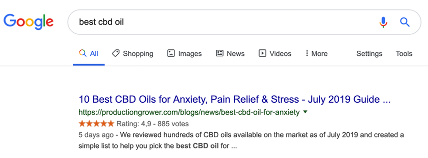
- Title: the title should have been shorter, but it does contain the most important keywords at the start, and it also includes what the CBD oil addresses: anxiety, pain relief, and stress relief.
- URL: while the
/news/part of the URL could have been left out, it’s still short, so it’s OK. - Stars: the stars help the snippet stand out among the competition, and they add credibility.
- Description: the article has recently been updated, and—while it could have been a bit shorter—it describes exactly what we’re looking for: they’ve reviewed hundreds of CBD oils and created a simple list for us.
This snippet is winning clicks.
When you think about high priority steps of a user journey, you might think of the home page or key product pages, the site navigation, or the checkout flow. And you’d be right—these are pivotal moments. But an often overlooked fact is that a good user experience actually starts at the search engine level. On top of that, most folks agree that click-throughs over time can have a positive impact on our ranking overall.
That’s why meta descriptions and titles deserve as much thought, care, and strategy as the finely tuned copy on your site’s home page.
Winning the user’s trust
You’ve gotten the clicks—users have landed on your page. But have you earned their trust?
In today’s day and age, we need to touch on trust and credibility as well.
Especially for “Your Money or Your Life” (YMYL) queries, these two are really important. For example, would you submit your income records over an insecure connection or take medical advice from a complete stranger with no medical background?
No, and rightfully so: these are sensitive topics.
To gain your users’ trust and be credible, you need to:
- Serve your pages over a secure connection (HTTPS).
- Have reviews and testimonials.
- Back up your claims with authoritative sources, and have experts fact-check your articles.
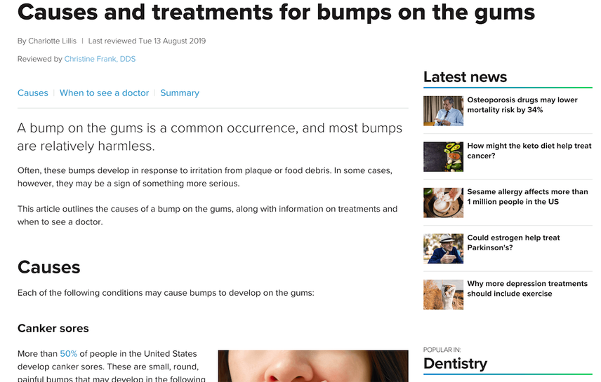
For instance, if you’re writing about something random like having bumps on your gums, and you’re not a medical professional, you can still write a great article and have a medical professional fact-check it. And then show your visitors that this has been done. This shows you’re taking things seriously and aiming to provide the best source of information.
Here’s an example where this is done well:
Answering their question fast
Nobody likes to wait, and your visitors aren’t any different.
According to Google , 53% of mobile site visits leave any page that takes longer than three seconds to load. Make sure to give your visitors their answers quickly.
Google finds fast loading pages so important, it's been a ranking factor for years. With the introduction of Core Web Vitals, they're taking it way further. It has really become a corner stone of their SEO best practices. To learn more about why page speed matters, we recommend checking out these recent case studies.
Explaining in detail how to ensure your pages will load fast is beyond the scope of this section; that deserves an article of its own. But even still, below you’ll find useful pointers to get started.
What really matters to your users is how soon your pages are usable. In technical terms, we call that “Time to Interactive (TTI)”.
Apply these best practices to ensure your pages load blazingly fast:
- Use a Content Delivery Network (CDN).
- Use caching and file compression. Minify your JS and CSS.
- Avoid render-blocking resources .
- Lazy-load your images and serve responsive images.
- Use image formats smartly (notably WebP and SVG).
To help you with this, here are a few tools for analyzing and speeding up your pages:
Don’t forget: perform real user tests as well! A tool can only do so much; at the end of the day the only thing that matters is that your users have a great user experience.
Providing a website that’s easy to use on any device
Great usability
Users want websites that are easy to use. How easy a website is to use is called its usability.
Simplified, this breaks down into having;
- a clear navigation structure across your website and within pages;
- a clear heading structure;
- content structured using the inverted pyramid;
- content formatted for great readability;
- content upgrades to increase that content’s usefulness.
Clear navigation structure
Let’s look at a few examples to see what we mean by a clear navigation structure:
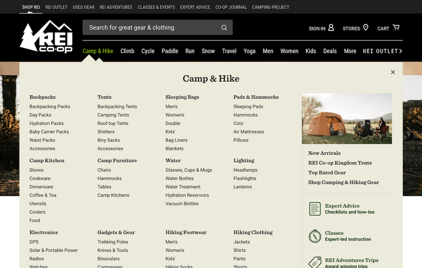
The outdoor store REI has done some great work to create a navigation that’s really clear. Their main navigation is organized by their users’ goals: camping & hiking, climbing, cycling, and so on. And within those goals it breaks down into what you need to achieve that goal. That might be a backpack, a tent, and a sleeping bag.
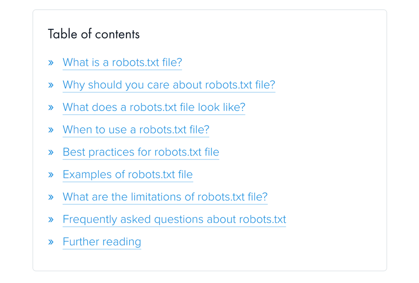
You can also use in-page navigation for long articles. Doing so enables your users to jump to the most relevant section immediately, skipping sections they’re not interested in.
Here’s an example—the in-page navigation for our in-depth guide on robots.txt files:
Clear heading structure
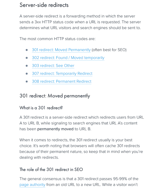
Headings are used to provide hierarchy and clarity to a web page. Using them helps visitors to quickly scan a page and helps search engines to easily understand its structure and topic.
The example below shows our guide on using redirects. Its headings make sense not only for users, but for search engines too.
Content structured using the inverted pyramid
The way you structure your content has a huge impact on a page’s usability. Imagine burying the answer to your visitor’s query at the bottom of a 3,000 word article! That makes the page pretty useless, which makes for poor usability and poor user experience.
Therefore, apply the concept of the inverted pyramid —which journalists have been using for a long time. Applying this concept means that you’re placing the most important information at the start of your content.
Content formatted for great readability
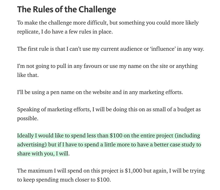
Make it easy for your visitors to read and digest your content by using white space and lists, while preventing walls of text.
Among other things, we love how Glen on detailed.com uses white space; see the screenshot below. To highlight important sections, he uses an eye-pleasing light green highlight.
Content upgrades to increase usefulness
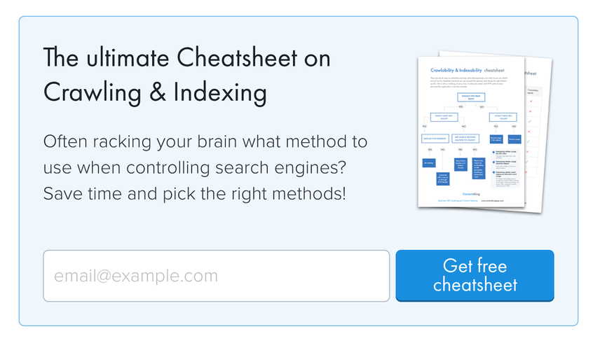
Think about content upgrades to increase the usefulness of your pages. Here are a few examples:
Are you covering a complex topic, and can a matrix, flow chart, or decision tree help your users to thoroughly understand that topic much more quickly? Have an illustrator make that upgrade, then offer it as a download.
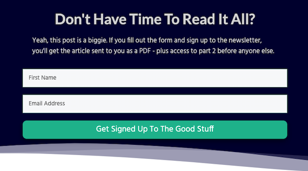
What if your users are interested in your content, but aren’t in the position to read a 5,000 word article at the moment? Let them leave their email address so you can send them that article in a PDF version.
Here’s an example from Raynernomics :
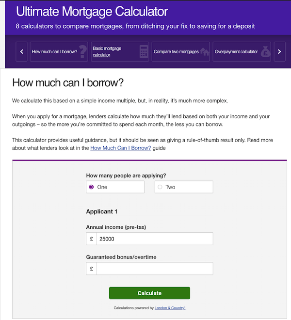
If someone’s reading your page to see how much money they can borrow to buy a house, it can be really useful to include a calculator on the page, enabling your user to get some ballpark figures as to what they can expect.
Here’s how MoneySaving Expert.com does this :
Go easy on the ads and pop-ups
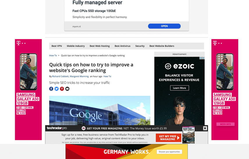
Many businesses rely on selling ads as a business model… but in most cases ads are just a distraction for your visitors. Go easy on them.
In Google’s Quality Rater Guidelines section 6.7, “disruptive ads” are mentioned several times. For good reason, because they hurt a visitor’s experience.
Here’s an example of a page where its content is basically buried underneath ads:
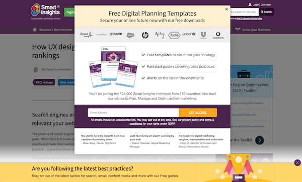
The same goes for pop-ups to gather newsletter signups, or request white papers. Often websites are programmed to show a pop-up after a visitor is on a website for, say 30 seconds. But what if the user has just opened a couple of websites in different tabs without having looked at them?
That user is then presented with something like this when visiting the tab:
How to mess up your user experience by going overboard with ads and pop-ups
Have you ever…
- Clicked on an ad on Facebook for a product you're interested in, and immediately received a pop up telling you about the deal of the day?
- Searched Google for answers to a particular problem you're facing, clicked on an article that seemed promising and immediately got a pop up inviting you to subscribe to their email list, before getting to read the content you intended on reading?
These are both examples of poor user experiences, of disregarding what people really need, and using pop ups incorrectly.
Here are some examples of high-converting pop ups we've used at GetUplift for our clients, that improve user experience:
- A pop up offering more relevant information for people who have scrolled more than 40% on an article page.
- A pop up inviting people to subscribe and get a coupon code when they reach a product page (not immediately on the homepage).
- A pop up inviting people to answer a survey on their 3rd visit to the site and after visiting at least 3 pages.
- A pop up inviting people to schedule a demo, after visiting the pricing page and not converting.
Everyone loves to hate pop ups but the truth is, that pop ups can work extremely well and even improve the user experience , when done correctly.
Countless pop ups, with no context, value or benefit can cause more abandonment, let-down and lower conversions. However, pop-ups focused on the value of the user can help people take the next step, find the information they need, get answers they're searching for and even convert. Remember: it's all about the context and intent of the people behind the screen.
Mobile friendliness
Mobile friendliness is an essential part of delivering a great user experience. It needs to be easy for users to use your website, and they need to be able to use it on any device.
You need to have a responsive website, one that ensures that its text size is readable on any device, its content isn’t wider than the screen, and there’s enough room between clickable elements.
Google’s mobile-friendliness tool helps you analyze your website’s mobile friendliness.
Wrapping up the role of UX in SEO
UX plays a massive role in SEO. If you want to excel at SEO, you need to make sure your UX is on point.
Here’s what a great user experience looks like:
- Give users a satisfying answer to their question.
- Do this blazingly fast…
- …through a site that’s easy to use on any device.
You can achieve that by:
- Hitting search intent
- Winning the actual click
- Answering the visitor’s query…
- While making sure pages load fast, the website is usable on any device, and the usability is good.
The key to your users’ and search engines’ hearts is delivering a great user experience.


